COLOUR.... MY EYES ARE DANCING

Posted by Bethan Holt, Fashion Junior at Large

Bright eyes... Meadham Kirchhoff beauty looks from AW12 (image from www.lloyd-evans.com)
Maybe it's the sudden turn in the weather from bright to dismal, or perhaps it's the amount of time the FashEd and I spend looking at the specifics of colour in our consultancy projects, or it could be that walking into most stores at the moment involves being confronted with such powerful, undiluted palettes. Whatever it is, my eyes have become addicted to complete overdoses of rich and saturated tones, whether it is the tangerine neon of the jumper I bought the other day, or the bloody rich maroon in J.W Anderson's AW12 collection, the picture of which I just cannot stop looking at. I feel like the pastel trend which so dominated the SS12 catwalks hasn't quite hit my consciousness yet. In fact, in a few weeks time these could become a diluted antidote to the intensity which is pervasive in my mind right now.

My colour obsession... JW Anderson AW12 (image from catwalking.com)
The road to York through Sledmere by David Hockney 1997 (from www.hockneypictures.com)
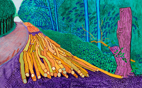
It was on a visit to the Royal Academy's David Hockney exhibition (a few days before it closed) a couple of weeks ago that I felt like my colour channel was  properly attuned. The only way I can even begin to describe the feeling of looking at a Hockney painting is that it makes your eyes dance, so vibrant are the colours and the ways they're combined. The images which I have included here do not even begin to visually describe the effect of seeing a Hockney original. I would love to know how he achieves this insanely concentrated bouncing-off-the-canvas-it's-so-bright effect.  His eye transforms the gentle browns greys and greens of the natural landscape into cyan blue leaves, lilac roads and pink skies. They're delicious and unexpected combinations.
More felled trees on Woldgate by David Hockney 2008 (from www.hockneypictures.com)

And the book I most want to read right now? A Pantone Colour Book. Odd, I know given 
that I'm more often found with my nose buried in classic literature but the thought of looking
 at that faded, brownish paper and uniform black type just makes my heart sink, especially
 when I could be poring over seven pages of 'pink' representations. 

I like to think that this new found colour obsession might be my version of patriotism, 
given the upcoming Jubilee, bear with me here. One of the highlights of this month's 
Vogue is the back page on which the magazine charts Her Majesty's colour choices 
over the course of a year. It looks to me like The Queen might also be a fan of the Pantone 
book, so considered are her head-to-toe choices of hue, from the palest of lemon curd 
yellows to the rubiest of Wizard of Oz reds she seems to have worked her way through 
them all. I can imagine her handing her circled colour choices to her dressmaker Angela 
Kelly as reference guide to her latest outfit creation.  

Devastatingly, I don't have my own Angela Kelly to rustle up something in my latest
 colour whim so I will amuse myself a while longer looking at my new favourite Tumblr,
 RAINBOW C-O-L-O-U-R-S

The Queen in colour (image from www.dailymail.co.uk)